About this work:
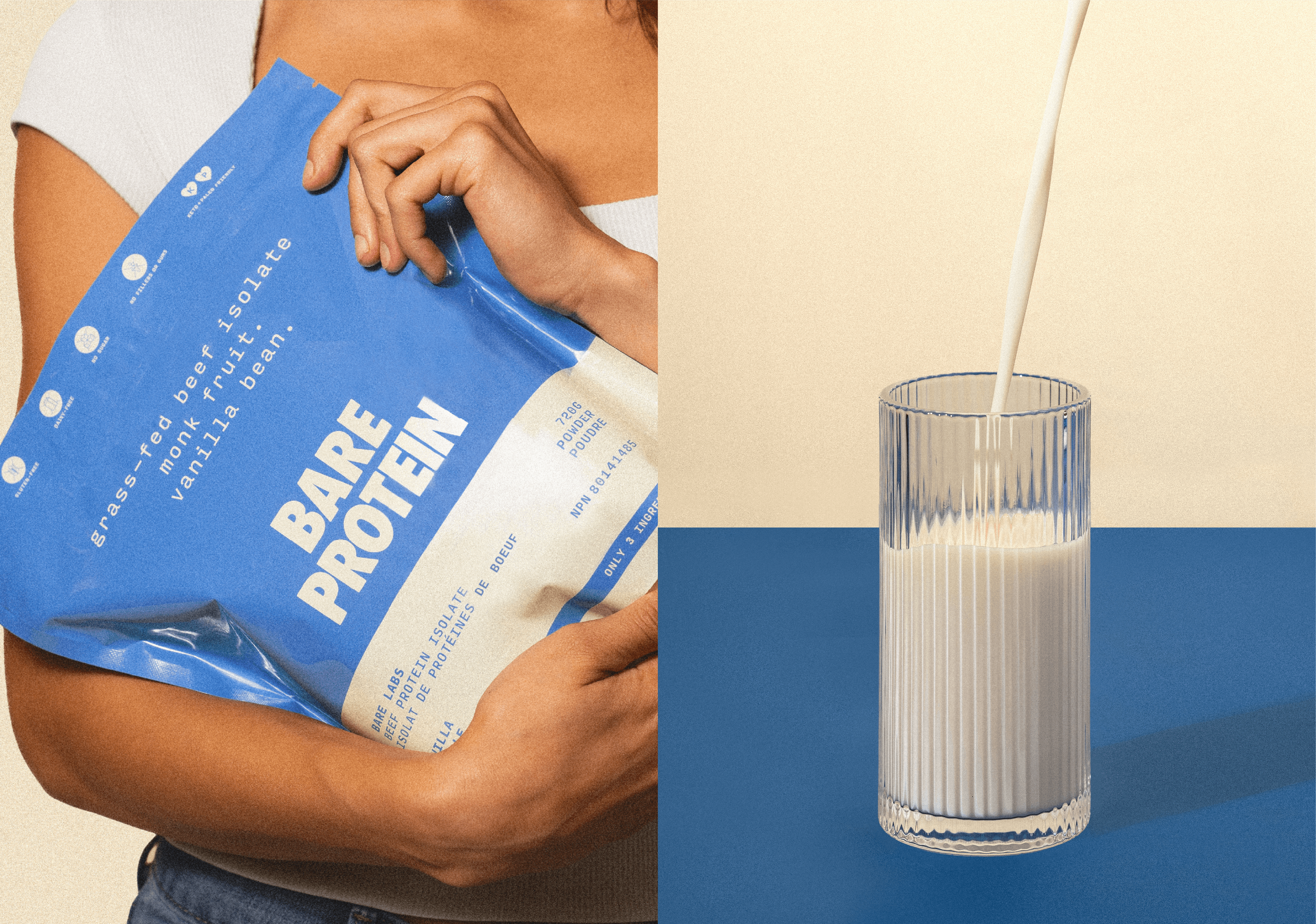
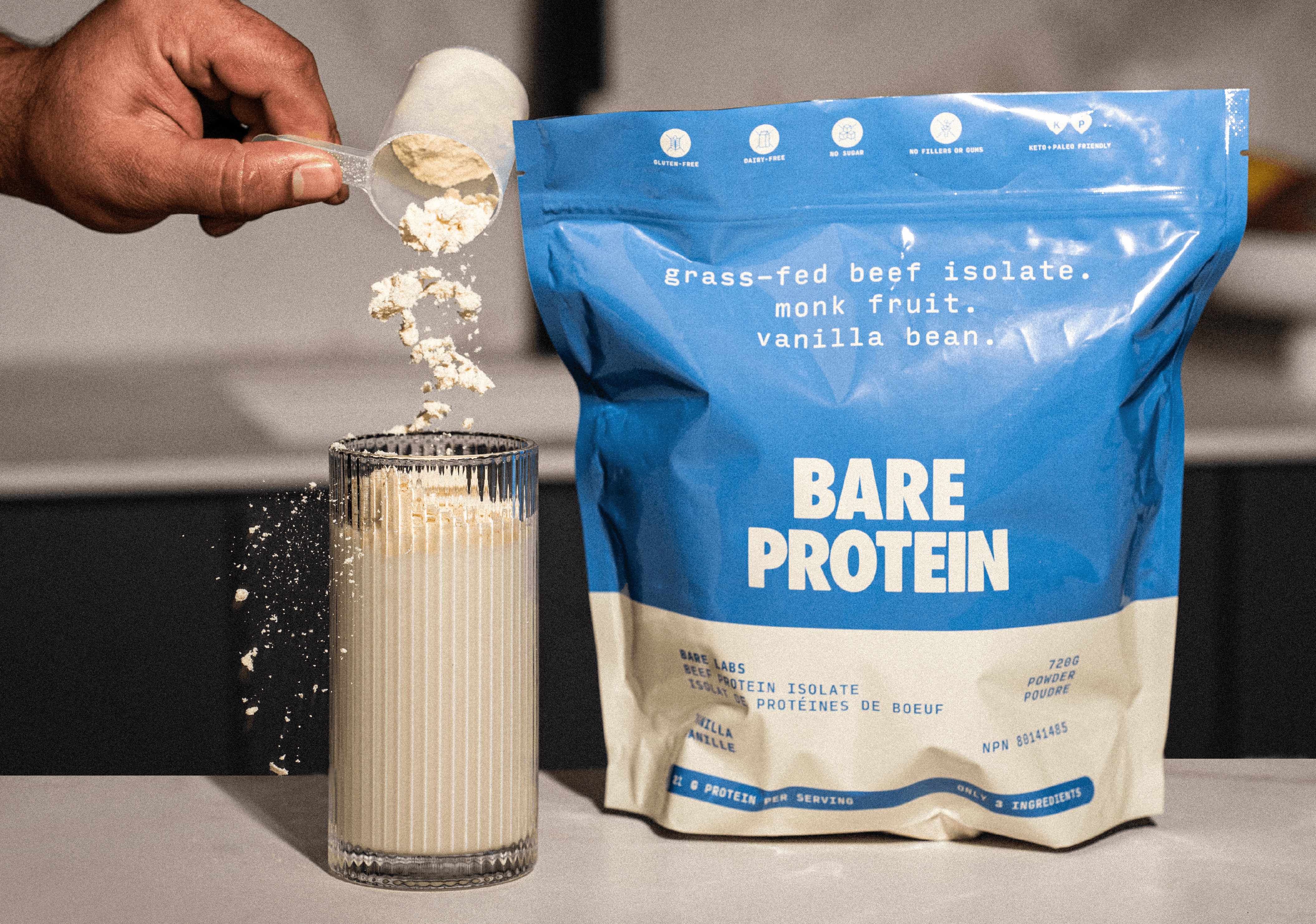
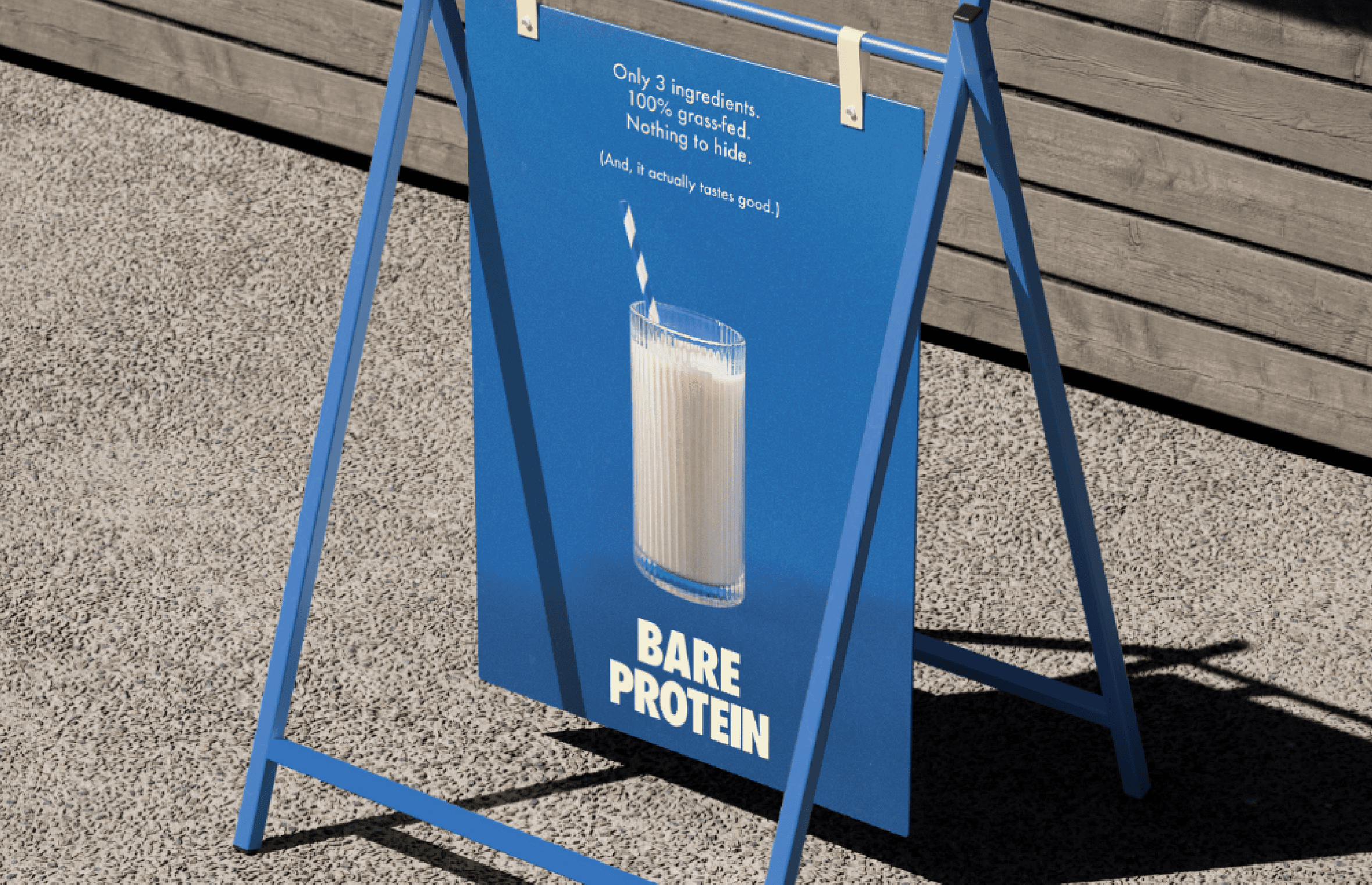
BARE Protein’s identity was created to feel honest, functional, and quietly confident within an often over-designed category. Branding and packaging emphasize ingredient transparency, clarity, and shelf presence while maintaining warmth and approachability. The visual system strips away excess, allowing the product to lead.
Year
/
2025