About this work:
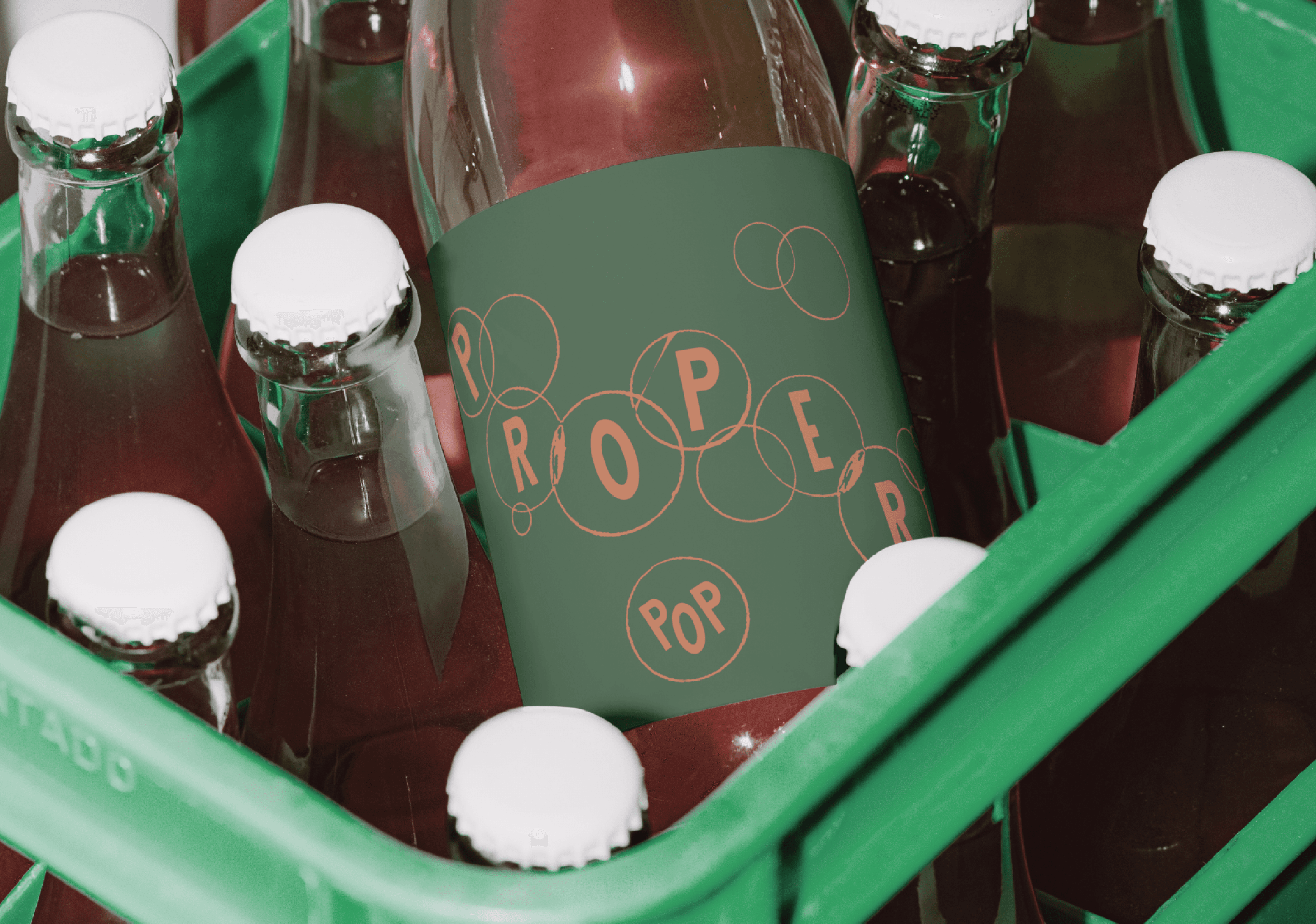
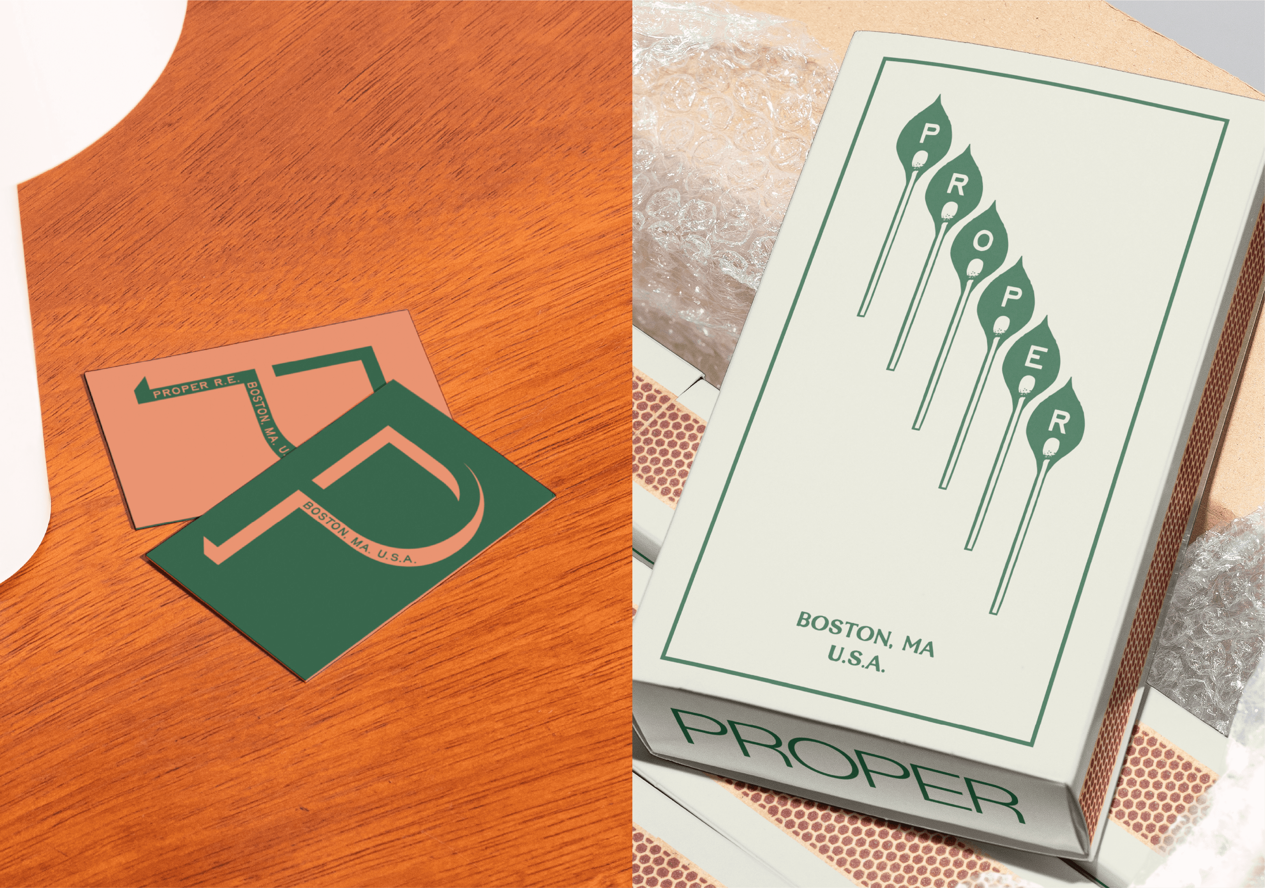
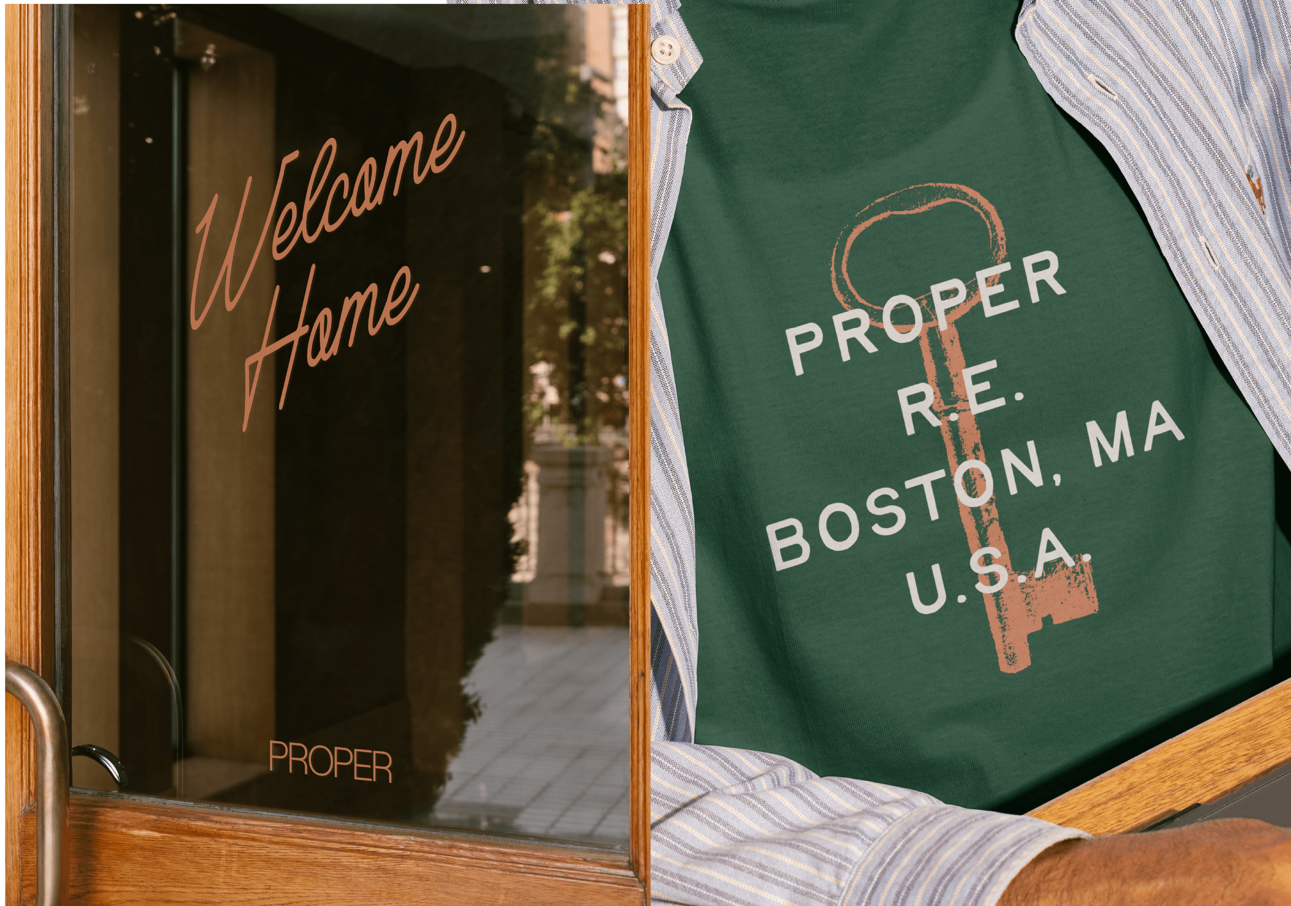
PROPER’s identity was built around precision, balance, and quiet authority. At the core of the system is a custom logotype designed as the brand’s primary anchor, meticulously constructed through refined geometry, balanced proportions, and considered negative space. The result is a wordmark that feels timeless yet contemporary, communicating both expertise and approachability within the real estate landscape. Beyond the core identity, the brand system was designed to support evolution and contextual expression without compromising recognition. Complementary graphic treatments allow the brand to expand across social, events, and premium touchpoints while remaining grounded in the foundational logotype. This balance between structure and flexibility enables PROPER to maintain consistency at scale while embracing creative exploration.
Year
/
2024